


 (No Ratings Yet)
The Science Behind Google Chrome’s New Security Indicators
Telling the internet if their connection is secure with a single icon.
If you know SSL, you know how difficult it can be to explain. Encryption. Authentication. Man-in-the-middle attacks. Revocation. Self-signed certificates. Where do you start!? How do you explain all the nuances of connection security?
Better yet, how do you explain all of that with one icon and two words? That’s the challenge that browser UI has to solve, and unsurprisingly, it’s not something that’s been totally figured out.
Connection security indicators, the icons in your address bar that tell you how your connection is made (with HTTP or HTTPS), are the most commonly seen browser security UI. But researchers are skeptical about a general audience’s comprehension of these indicators.
That’s why Google and University of California, Berkeley worked together to study and design new connection security indicators. New indicators, partially based on the findings of this study, are incorporated into Chrome (on Mac now in Version 52, and coming in Version 53 on Windows). They presented their research in a paper titled Rethinking Connection Security Indicators[1]last month at 2016’s Symposium on Usable Privacy and Security.
Previous findings have been mixed. A study by Whalen and Inkpen found that more than half of participants recognized or looked for a security indicator on a page.[2] Conversely, in a study by Schechter et al, every user logged into an online bank account despite the site being loaded over HTTP, suggesting that none of them noticed the lack of a secure indicator.[3]
For this study, Chrome’s team hopes to improve users’ comprehension of the icons.
Their results showed that most participants understood the meaning of the widely-used green padlock, which indicates an HTTPS connection. The most surprising finding was that the HTTP page icon confuses more people than the HTTPS padlock.
There was room for improvement across the board, which is why Chrome will be changing two of its indicators entirely while altering the third.
Let’s delve a little deeper into what the study found.
Green is Good, Right?
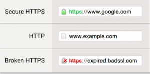
Before tinkering with anything, Chrome’s team tested their existing indicators (seen in the picture to the right). There were three: the green padlock for valid HTTPS connections, a white page icon for HTTP or HTTPS with minor errors, and a gray padlock with a red-X overlapping it for HTTPS connections with major errors.
Last year Chrome eliminated a fourth icon, which proved to be too harsh and confusing. For now, three icons is the sweet spot between accuracy and clarity. Eventually, Chrome wants just two: secure and not secure. But that will have to wait for more of the web to adopt HTTPS.
A majority of the survey responses correctly identified the meaning of the green padlock. They either mentioned the SSL/TLS or HTTPS protocol directly by name, that the connection to the site was secure, or that the site had a trusted certificate.
Only 4% of responses were totally off the mark, incorrectly identifying, or not knowing, the padlock’s meaning. So the green padlock is largely doing its job. Which isn’t necessarily a surprise – the padlock has been used for HTTPS connections for more than a decade.
What was shocking was how many people misunderstood the page icon used to denote an unsecured HTTP connection.
Again, most responses had a general sense of the icon’s meaning. Most mentioned that the icon indicated the page was not secure, or that HTTP was being used. About 8% of responses said it indicated a ‘regular web page,’ highlighting the belief that an unsecured HTTP connection is still the default state of the web.
But, a significant number of responses did not know what the page icon meant. They gave a variety of explanations, including that it was the bookmark icon, the site’s favicon, that they did not know it’s meaning, or that it meant nothing at all. All in all, around a quarter of responses did not associate the icon with an HTTP connection. Just over 2% of responses had it completely wrong and thought this icon meant HTTPS was in use.
The authors noted that their sample was likely biased towards tech-savvy users, so the understanding of both icons among the entire Chrome user base “is likely even lower.”[4]
What Makes a Good Icon?
“Security indicators are the most commonly seen browser security UI,” and every major browser has them. Yet, “despite this ubiquity, people often find browser security indicators confusing.” [5]
The goal of this particular study was to find three icons that clearly represented the types of connections. One icon strongly associated with a secure connection, one strongly associated with an insecure connection, and an icon which was only moderately associated with insecurity. [6]
These icons would become the new indicators for secure HTTPS connections, broken HTTPS connections, and unsecure HTTP connections.
Picking meaningful and widely-understood connection security indicators means considering every aspect of the icon’s design. To that end, Chrome’s team tested the shape, color, and perception of their proposed icons.
Some of their results were unexpected. For instance, users did not “have a clear favorite” color for an icon representing a secure connection. A red padlock and green padlock was preferred in almost equal numbers.
The authors outlined some general principles for good icons: they must scale down well so they are clear on all screen sizes, and they must communicate their meaning without relying on color to do so (for accessibility reasons – did you know 8% of men are colorblind?). Icons should be “understandable without significant thought.”[7] So they choose shapes that have historically been used to represent safety or danger.
They also wanted to avoid “overload[ing] the meanings of shapes.”[8] Both Chrome and Firefox currently do this by using a padlock with a combination of other symbols to indicate different states, which is confusing to those with less knowledge of cyber security. The new icons avoid this, each has its own unique shape and unique color.
A persistent challenge has been communicating the specific connection security benefits of SSL/TLS. As much as we would all love it to be true – a site using SSL is not necessarily “secure” in the general sense. For example, while your connection may be secured with SSL, the site could be infected with/distributing malware.
Chrome’s team found that users associated the indicators with other computer security risks – such as malware distribution and general technical bugs. Differentiating between these threats has been one of the biggest challenges in user education.
Two of the icons – the padlock with the red-X and the page icon – received the most drastic design changes.
The current Chrome icon for HTTPS with major errors is a grey padlock with an overlapping red x (seen on the bottom left in the above photo). This fails their standards across the board. It re-uses an existing icon, relies on color, and scales poorly.
“Most of our extension survey respondents did not relate Chrome’s HTTP indicator to connection security, despite their tech-savvy demographics.”[9] It was clear then, that the page icon was not working.
And the Winners Are…
The paper combined the results of their surveys with their general guidelines for good icon design to pick three winning icons and two accompanying text strings. You can see the choices in the picture to the right.
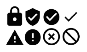
For valid HTTPS, they selected a padlock with a hole cut out of the center, representing a keyhole. This is only a slight tweak in style and color from the existing and well-accepted icon.
For HTTP and HTTPS with minor errors, they ended up tweaking one of their initial choices. “After testing, we modified the [“!” in a circle] icon to more closely resemble the ISO Information Symbol; we hope that it will attract clicks from curious users seeking further information about the website.”[10]
For HTTPS with major errors, the exclamation point inside of a triangle was selected. Another candidate – the circle with a slash through the center – performed nearly as well in the user studies. But, the triangle won the tie because it was more visually distinct and would scale down more effectively.
These new icons still aren’t perfect. Chrome’s team noted that the winners did not widely outperform the other options tested and that many users still associate the icons as general security indicators, and “not specifically as connection security indicators.”[11]
You may notice the new indicators in Chrome 53 are not exactly the same as what is shown in the mockup above. The padlock with the hole in it was not adopted, nor were the text strings.
The changes in Chrome 53 “are the first step in an overhaul of how Chrome communicates connection security state”, wrote the Chrome security team.[12] So we should expect that the UI will continue to be refined over time.
The authors also noted that they “would like to see other products that convey connection security adopt similar shapes to reinforce the meaning of the indicators,” and they have made all the icons they designed free to use as part of Google’s Material Design guidelines.[13]
[1] Adrienne Porter Felt et al. Rethinking Connection Security Indicators. SOUPS, 2016.
[2] T. Whalen and K. M. Inkpen. Gathering evidence:
Use of visual security cues in web browsers. In
Proceedings of Graphics Interface, 2005. (As cited in Felt et al, 2016).
[3] E. Schechter et al. The emperor’s new security indicators: An
evaluation of website authentication and the effect of
role playing on usability studies. In Proceedings of
IEEE Symposium on Security and Privacy, 2007. (As cited in Felt et al, 2016).
[4] Page 5
[5] Page 1
[6] Section 6.4
[7] Page 11
[8] Page 11
[9] Page 11
[10] Page 11
[11] Page 11
[12] https://groups.google.com/a/chromium.org/forum/#!topic/security-dev/aAtvHYFXRVo
[13] Page 12


5 Ways to Determine if a Website is Fake, Fraudulent, or a Scam – 2018
in Hashing Out Cyber SecurityHow to Fix ‘ERR_SSL_PROTOCOL_ERROR’ on Google Chrome
in Everything EncryptionRe-Hashed: How to Fix SSL Connection Errors on Android Phones
in Everything EncryptionCloud Security: 5 Serious Emerging Cloud Computing Threats to Avoid
in ssl certificatesThis is what happens when your SSL certificate expires
in Everything EncryptionRe-Hashed: Troubleshoot Firefox’s “Performing TLS Handshake” Message
in Hashing Out Cyber SecurityReport it Right: AMCA got hacked – Not Quest and LabCorp
in Hashing Out Cyber SecurityRe-Hashed: How to clear HSTS settings in Chrome and Firefox
in Everything EncryptionRe-Hashed: The Difference Between SHA-1, SHA-2 and SHA-256 Hash Algorithms
in Everything EncryptionThe Difference Between Root Certificates and Intermediate Certificates
in Everything EncryptionThe difference between Encryption, Hashing and Salting
in Everything EncryptionRe-Hashed: How To Disable Firefox Insecure Password Warnings
in Hashing Out Cyber SecurityCipher Suites: Ciphers, Algorithms and Negotiating Security Settings
in Everything EncryptionThe Ultimate Hacker Movies List for December 2020
in Hashing Out Cyber Security Monthly DigestAnatomy of a Scam: Work from home for Amazon
in Hashing Out Cyber SecurityThe Top 9 Cyber Security Threats That Will Ruin Your Day
in Hashing Out Cyber SecurityHow strong is 256-bit Encryption?
in Everything EncryptionRe-Hashed: How to Trust Manually Installed Root Certificates in iOS 10.3
in Everything EncryptionHow to View SSL Certificate Details in Chrome 56
in Industry LowdownA Call To Let’s Encrypt: Stop Issuing “PayPal” Certificates
in Industry Lowdown