


![A Look at 30 Key Cyber Crime Statistics [2023 Data Update]](https://www.thesslstore.com/blog/wp-content/uploads/2022/02/cyber-crime-statistics-feature2-75x94.jpg)


 (No Ratings Yet)
Eliding: What It Is and Why It Matters
Understanding how and why browsers display origins and URLs
The address bar in our browser displays the origin we are connected to, and in doing that, it is probably the single most important piece of browser UI. It tells us where we are the internet and ‘who’ we are connected to. When it comes to evaluating the safety of a site, it may be the best tool a user has.
However, most origins and URLs are incredibly confusing and pose a usability problem. They have too many components, contain lots of technical information that is useless to everyday users (or any user, as many URLs have huge strings solely for the benefit of the server) and attackers can intentionally create confusing URLs for social engineering.
For browsers, properly displaying a URL is a lot of work. One of the main tools a browser uses is eliding.
Eliding is the process of omitting parts of a URL (or origin) for simplicity or proper display. For example, take this URL:
http://really-long.annoying-website.com:80/blog/about-us/
There are two problems with this URL. First, it has components that do not add any additional information, and are essentially wasting space and confusing users. It is also very long and will be hard to fit in an address bar.
To deal with both these problems, browsers elide.
There are three main reasons to elide: simplicity, security, and space.
The first thing to do is get rid of those useless components: the scheme (“http://”) and the port (“:80”). In this case, these are both the ‘defaults’ of the web – unless told otherwise, it’s assumed you are connected to an insecure, unauthenticated origin. So, displaying “http” adds no useful information, and actually risks confusing users by showing them more than is necessary. Same logic for eliding port 80 – that is the default port for http.
(Note that this is contextual. If this was an https URL, you would not want to drop the scheme as its conveying important information: that you have a secure connection. Same applies if you were connecting over a non-standard port.)
That leaves us with:
really-long.annoying-website.com/blog/about-us/
That is an improvement, we have made the URL simple by getting rid of the unnecessary parts. This makes it easier for a user to comprehend the URL.
But now we have to deal with space and security – in many ways these are intertwined. In a lot of cases, it is going to be required to visually truncate the URL. But when truncating, you need to make sure you are preserving the important parts of the URL, and not creating a situation where attackers could craft misleading URLs.
On mobile there will almost never be enough space to display the origin, let alone the full URL. Space is also a concern on low-resolution monitors and laptop, as well as high-resolution screens with smaller window sizes.
You also have to account for attackers who are going to purposefully craft long URLs to confuse and imitate. This means that even on the highest resolution monitors, space primarily becomes a security concern.
The goal is to fit the most important parts of the URL into the space available so the user can clearly identify the origin they are on.
Depending on how much space is available, a browser might have to sacrifice the majority of the URL. For example, on an 4” screen iPhone, Chrome will barely have enough space to show the domain itself.
Safari moves most of its UI to the bottom, giving more room to the address bar. But they still opt to show only the origin, eliding everything after the “/” unless the address bar has focus.
After eliding both the unnecessary components, and dealing with a very cramped address bar, we are left with the bare minimum:
annoying-website.com
It is key to make sure that you aren’t eliding *any* part of the URL to make it fit. Browsers need to apply logic, instead of just indiscriminately dropping characters from either end. Imagine the various usability and security problems with displaying the following segments in the address bar:
“really-long.annoy”
ying-website.co
“website.com/blog/about-us”
When you are eliding, direction matters.
Elide to the left! (Don’t) Elide to the right!
If done improperly, eliding can severely harm users and create an environment ripe for social engineering.
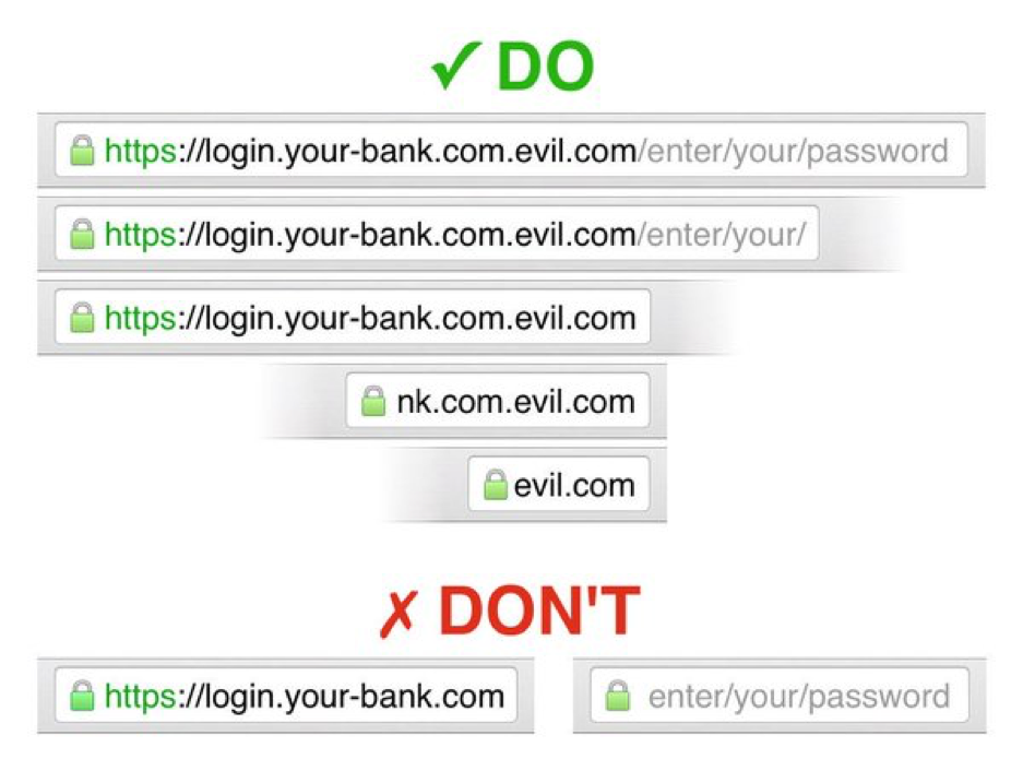
To show the real-world problems that can come from improper eliding, let’s use an example URL that it typical for a phishing site.
We have a malicious website using a long domain name, in order to mimic a legitimate-looking URL:
Paypal.com.myaccount-cgibin.com
Again, let’s assume we can’t show user the whole URL, and we need to make a decision on what part we do show.
Eliding from the right would mean dropping characters starting at the right hand side, until it fits in the allotted space. That means the first thing to go is the domain name. If the phisher makes the URL long enough, he can push out everything but the left-most section and we end up with this in the address bar:
Paypal.com.mya…
Yikes! Now there is a very good chance our user is going to believe they are on the real Paypal site! Hopefully an experienced user will notice the “.” after “.com” and realize the problem, but this only protects a small amount of our audience. Some of our experienced users are probably tired, in a rush, or just not second-guessing every bit of UI they see, so they are also at risk.
If our users click the address bar, we could expand it and expose more of the URL. But if they trust their browser, why would they think to do that? Usually browsers display a gradient fade or ellipses indicating the URL is being truncated, but that won’t give many users a fighting chance.
So, eliding from the right is not the right choice. It does not guarantee we will display the domain name and it gives the attackers the full control to construct a convincing URL.
Instead, let’s try eliding from the left:
…ount-cgibin.com
That’s better! Now the user is seeing the most important thing: the domain. Because the domain is long, we couldn’t fit it all in there (which could still allow for some clever crafting of a URL). But we have hidden the subdomain entirely, which is very important given that subdomains are not unique and usually useless in identifying a website.
In reality, it is much more complicated than just picking “from the left” over “from the right.” Browsers also need to understand the importance of prioritizing the origin (more on that in the next section), and use visual cues to highlight the most important parts of the URL.
Here is a graphic from The Chromium Project showing examples of proper and improper eliding:
Displaying Origins and URLs
Eliding is one of many tools that browsers and other user-agents use to improve the display of URLs.
There are also visual cues, trusted UI, and icons that help a user understand where they are and what they are doing. As the screenshots above show, Chrome uses two different colors to differentiate the fully-qualified domain from the path and query. Other browsers like Firefox and Opera use similar methods to improve the display of URLs.
At the end of the day, the proper display of URLs should be considered a basic usability principle. For instance, just because you can show the entire URL does not mean that you should. A user has a better chance at remaining safe, and just having an easier time, when the browser intelligently displays the URL for them.
Unfortunately, many user-agents do not handle URLs properly. Many apps, like Facebook and Twitter, now handle web browsing natively. Because they are not full-fledged browsers, they usually have rudimentary and unrefined UIs that do not follow some of the basic principles of proper URL display.
Who thought displaying a URL was such hard work?


5 Ways to Determine if a Website is Fake, Fraudulent, or a Scam – 2018
in Hashing Out Cyber SecurityHow to Fix ‘ERR_SSL_PROTOCOL_ERROR’ on Google Chrome
in Everything EncryptionRe-Hashed: How to Fix SSL Connection Errors on Android Phones
in Everything EncryptionCloud Security: 5 Serious Emerging Cloud Computing Threats to Avoid
in ssl certificatesThis is what happens when your SSL certificate expires
in Everything EncryptionRe-Hashed: Troubleshoot Firefox’s “Performing TLS Handshake” Message
in Hashing Out Cyber SecurityReport it Right: AMCA got hacked – Not Quest and LabCorp
in Hashing Out Cyber SecurityRe-Hashed: How to clear HSTS settings in Chrome and Firefox
in Everything EncryptionRe-Hashed: The Difference Between SHA-1, SHA-2 and SHA-256 Hash Algorithms
in Everything EncryptionThe Difference Between Root Certificates and Intermediate Certificates
in Everything EncryptionThe difference between Encryption, Hashing and Salting
in Everything EncryptionRe-Hashed: How To Disable Firefox Insecure Password Warnings
in Hashing Out Cyber SecurityCipher Suites: Ciphers, Algorithms and Negotiating Security Settings
in Everything EncryptionThe Ultimate Hacker Movies List for December 2020
in Hashing Out Cyber Security Monthly DigestAnatomy of a Scam: Work from home for Amazon
in Hashing Out Cyber SecurityThe Top 9 Cyber Security Threats That Will Ruin Your Day
in Hashing Out Cyber SecurityHow strong is 256-bit Encryption?
in Everything EncryptionRe-Hashed: How to Trust Manually Installed Root Certificates in iOS 10.3
in Everything EncryptionHow to View SSL Certificate Details in Chrome 56
in Industry LowdownPayPal Phishing Certificates Far More Prevalent Than Previously Thought
in Industry Lowdown